While some design guidelines are flexible, this specific color rule is one to embrace when revamping your kitchen this year. The 60-30-10 method is essential for achieving a well-balanced and engaging palette.
Your kitchen's colors significantly impact its aesthetic. With various surfaces interacting, selecting the right balance and combinations is crucial for an elevated design.
Designers frequently recommend the 60-30-10 rule to ensure your kitchen's color distribution is spot on. Here's what you should understand about this approach, its effectiveness, and how to select the ideal hues.
Understanding the 60-30-10 Color Rule

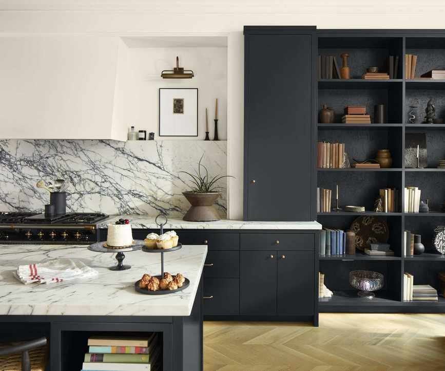
In this setup, wood dominates at 60 percent, white serves as the secondary hue, and the dark accents on the island and cabinetry complete the last 10 percent.
Selecting hues for your kitchen can be daunting with so many components to consider. However, the 60-30-10 theory simplifies this task, allowing you to create a unified color scheme.
'The 60-30-10 rule suggests that 60 percent of a room should be one color, typically a neutral, 30 percent should be a secondary hue, and the remaining 10 percent should be a vibrant or unique accent color,' explains interior designer Bethany Adams.
'This systematic method is beneficial for those who appreciate structure in design, as it offers clear guidelines for developing color schemes,' adds Arianna Barone, Color Marketing Manager.
Benefits of This Approach for Kitchen Color Schemes
'The countertop and backsplash unify the primary color, Mopboard Black CW-680, with the wall color Sail Cloth OC-142. Accents in bronze further harmonize these colors through smaller elements like hardware and lighting,' explains Arianna.
This rule can be applied across various rooms, but it works particularly well in kitchens, as the proportions align seamlessly with essential elements.
'The proportions of cabinets, countertops, and backsplashes correspond closely to these percentages, making it ideal for kitchen designs,' states Bethany.
Kitchens, with their numerous hard surfaces, benefit from a triadic color scheme to maintain visual appeal. 'With elements like tile, countertops, and cabinetry, creating a cohesive look can be challenging,' Arianna points out.

'In this kitchen, the island features New Hope Gray 2130-50 and the backsplash is a lighter version. These are considered the secondary colors, while Swiss Coffee OC-45 serves as the primary color throughout the walls, ceiling, and cabinets. Rattan accessories provide the accent color,' explains Arianna.
'The 60-30-10 rule can simplify creating a harmonious color palette. Consider making 60 percent of the room your wall and/or cabinet color, forming the foundation of the space. Since cabinets occupy most wall space, they should represent your primary color.'
'Next, 30 percent should be your secondary color, providing contrast to the primary. This could be an island, backsplash, or countertops, or even a different color for lower cabinets,' she continues.
The remaining 10 percent can be filled with smaller details like lighting fixtures and decorative items. This formula fits perfectly with the various elements found in kitchens.
Selecting Colors for Each Proportion in Your Kitchen

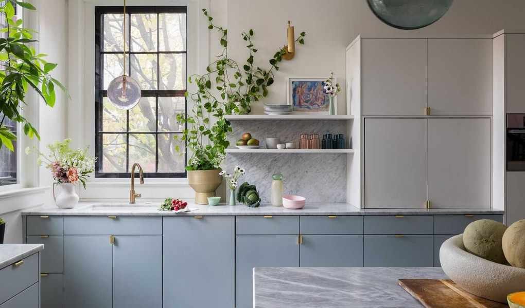
This design exemplifies the 60-30-10 color rule. Wood serves as the primary hue with cabinets and island, while beige backsplash tiles reach the ceiling as the secondary color, and white accents appear in lighting and range hood.
When choosing three colors for your kitchen, cohesion is vital, yet the shades don't need to be similar. Don't hesitate to play with contrasts, light and dark tones, or vibrant colors.
According to Bethany, the process begins with determining the introduction of each color. 'Most of your color will stem from the cabinets, followed by the backsplash and countertops for the secondary color, and finally, accents like colorful stools for a pop of interest.'
Your color selections will hinge on the kitchen style you envision, its size, and your preference for neutral or vibrant palettes.
'First, think about the atmosphere you wish to create. Do you want an airy feel or a cozy, darker ambiance? I typically start with cabinet colors, as they dominate the space and anchor the overall design,' says Arianna.
Begin with the largest color segment. 'It's easier for most to make small decisions rather than selecting everything at once. First, decide if you want a neutral or a bolder shade for the cabinets. This initial choice helps establish your primary color,' she advises.

For a vibrant example, this kitchen utilizes white as the primary color for walls and cabinets, a blue floor as the secondary hue, with a red fridge adding a lively accent.
'After selecting your cabinet color, decide if you want the walls to match or contrast. If contrasting, the walls become your secondary hue,' she explains.
Maintaining contrast and balance is essential, so incorporate opposing tones for primary and accent colors to add depth and character to your kitchen.
'Ratio and proportion are crucial for ensuring harmony. If the primary and secondary colors are neutral, consider a pop of color in the accents. Conversely, if they are bold, opt for neutrals as accents to maintain balance and lightness.'
Once you have a clear idea of your three primary colors, you can refine details like backsplash tiles and countertops based on the design you choose.
Utilizing the 60-30-10 color rule in your kitchen encourages creativity while providing a framework for crafting a dynamic and cohesive design that feels vibrant and inviting, avoiding a dull or uninspiring look.
This color theory is adaptable to kitchens of various sizes and styles, whether you're aiming for a colorful scheme, a soothing cottage vibe, or a sophisticated urban kitchen.